It’s that time again! Judgement night. Critique. Feedback. Self torture (maybe)?
You may have other words or phrases to describe it! 😄
Changes to competitions
First off, it’s worth noting the changes to NDPS competitions this season.
These changes have been enacted after listening to feedback from club members, and as is always the case with clubs, societies, organisations, and companies, the old adage of “You’ll never please everyone…” applies.
Unlike last year, there is no POTY (Photographer of the Year) and no league tables except for judging the digital images. There are fewer rounds and some non-competition critique evenings. The idea being to encourage members to enter competitions.
A few details on the line-up:
- As mentioned above, two leagues still exist but they only apply to digital image competitions
- Print competitions are everyone and anyone, I.e. No leagues
- There are three digital image competitions and two print competitions
- Members can enter two images in every digital and print competition
- Images are open/pictorial save for one digital and one print round which will be themed
- Themed rounds will not be scored but will be judged on a knock-out basis
- There will be a print panel and image of the year competition
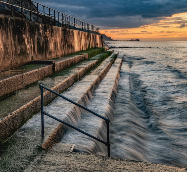
Image 1 – Hold the Handrail
I chose the following image from a sunset shoot in Overstrand in June.

I chose it because (sorry for the possible arrogance), I think it’s a stunning shot, but I will confess that this type of scene is my thing. A seascape with good light and texture in the water.
It was edited carefully by use of masks to enhance the sky and foreground. I removed some distractions in the concrete and removed a small wooden sign on the promenade at the top of the image. I didn’t need to apply denoise but I did apply a Nik filter, my usual favourite one.
I did need to fiddle about with the clifftop at top of image (middle) as it looked a little odd but I took care to try and darken it and apply a little bit of contrast rather than make it noticeable by going overboard.
The apparent brighter aspects near there are likely to be the evening heat (it was June) or the mist from the sea crashing onto the sea defences or shoreline. I only paid it some attention due to a previous known judge constantly moaning about background softness, even criticising it when miles away.
Self-critique (pre-judging)
I’m not sure what’s not to like with this image.
It tells a story…
The light shining on the concrete is awesome…
There is lots of interest here… the motion in the water, the pier in the background.
The judge may not like the square-ish crop but has to appreciate I couldn’t get all the elements in that I wanted with a traditional 3:2 or 4:3 crop.
The judge may not like the handrail and could even say they would’ve removed it, but that’s not what I captured and taking it out would remove the story, or at least the one I’m trying to convey!
For me personally, (bias acknowledged), this image is a 10/10 image all day long.
Judge’s verdict
The judge said they were not sure if this was sunrise or sunset (it was the latter).
They said they liked the leading line of the steps from the left of the image – good, because I thought about that, also the bottom right to, but they didn’t mention that.
They liked the shutter speed used to get the water effect.
They liked the sky and thought it was a ‘pleasing composition’.
For ‘Hold the Handrail’, the judge awarded a 9/10.
Post-judging thoughts
There’s no disgrace in a 9/10 score, and maybe my expectations were too high.
I would’ve been delighted to have been shortlisted so I am a little disappointed. This image has just slightly underperformed to my hopes and expectations.
What is very disappointing is I’ve been left bereft of any advice as to what I could’ve done better!
The only thing I did wonder seeing this image on the big screen is whether it was a little too bright, and whether I should’ve turned the brightness down a little for more impact.
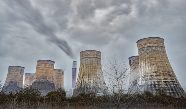
Image 2 – The Last Coal-fired Power Station
I chose the following shot was from a stop off on the way back from a two day Peak District photography trip at Ratcliffe-on-Soar near Derby.

I chose it because I feel it is a dramatic shot and has just recently stopped operation. Neither of those things will get me marks, and I’m once again choosing what I like so have to accept this may fall into the average category.
The edit was done from scratch and has been denoised, distractions like spotlights from the station and half pylons removed in Photoshop. I also used a Nik Colour Efex filter to bring out a little more detail in the towers.
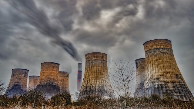
I’ve toned down and adopted a more muted colour palette than the social media edit which I hope gives a little more atmosphere, and a less aggressive image – see below for social media edit.

Self-critique (pre-judging)
I’m hoping the judge likes the drama of it and the slow shutter speed to catch the smoke from the chimney. I think it has a bleakness about it.
They may challenge to say would it have been better in monochrome? Personally, and I tried it, it wasn’t better. There is a colour to the towers, red lights on the chimney which I think are part of the story and it’s working operation alongside the emerging smoke.
They may or may not be aware of the recent closure of the station but I’m guessing they will recognise the scene as it is a popular location for photographers.
They may say it’s a record or documentary shot and usually these comments are a few seconds pre-warning of an average or lower score than I would want.
This image is definitely not as impactful as my first image, and I may come to regret punting it in, or consider that, with hindsight, I should’ve put it in the critique round.
I expect no less than an 8 and anything higher will be a pleasant surprise.
Judge’s verdict
The judge said they liked this image and its documentary aspect.
The quite liked the converging verticals, especially on the right hand side. They said usually judges will criticise that but for this image it works, and adds to the drama of the image.
They appreciated the long shutter speed (it was four seconds as it happens) to get the smoke effect from the chimney.
They liked the ‘scrub’ in the foreground which adds to the image.
For ‘The Last Coal-fired Power Station’, the judge awarded a 9/10.
Post-judging thoughts
I am very pleased with the score for this image, especially given my doubts post submission.
The judge was fair with comments and I suspect a different angle or something with even more drama would’ve been needed to push it further.
Reflections
Considering I have been moved up to the higher league, to score an overall 18/20 is very good.
As always, I’ll be my own worst critic.
It’s completely arrogant to expect a straight ten and to win with my Overstrand shot, but that’s what I felt and it was my gut instinct, so I can’t help but feel a tad disappointed.
For balance, I had thought the power station shot may only get 8/10 so I ended up underscoring on the first image, and over-scoring on the second.
Overall, I must feel that a 90% score from the evening in the higher league is not to be sniffed at. To coin a phrase… ‘I mus’n grumble’!
Onwards and upwards…