I thought it would be useful and interesting to review my NDPS POTY season, and reflect on things.
Achievements Reminders
- In the digital competition for my league, I achieved third place from 15 members, and only 1.0-1.5 points behind the runner-up and winner
- In the print competition, I achieved 6th place from 21 competing members from both leagues, or 13 members that entered all three print rounds
- Overall, I achieved 7th place out of 39 competing members which involved me submitting 25 images over digital, print and panel rounds
Whilst there is no “W” in anything other than first and winning place, these outcomes do demonstrate significant improvement and advancement in my efforts which is heartwarming, if not populating the mantelpiece! 😄
Now the dust has settled, my ups and downs and emotional attachment to the images dissipated, I feel in a good place to take another look.
What did I learn? Would I have changed anything?
Summary of entries / results
| Round | Image submitted | Judge’s Verdict | Would I do anything different? | Learning |
| Digital R1 Themed (Close-up) | 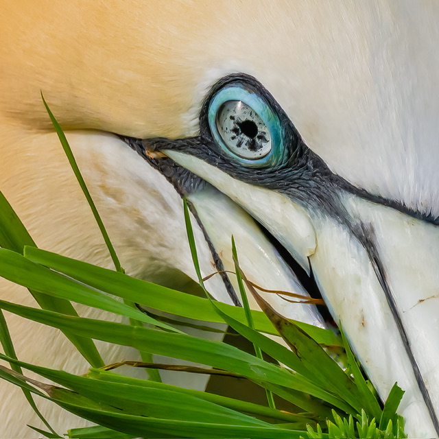 Aye Eye Scored 8.5 | Judge liked skin texture. Questioned presence of beak. More detail in eye and beak than feathers. | Maybe* | I feel the image deserved a little more. This was quite an aggressive crop on a shot taken with mid-range aperture. *If I knew I’d be wanting such a close-up, I would’ve shot with a longer range lens and/or with a narrower aperture – this would require a crystal ball though! |
| Digital R1 Free choice | 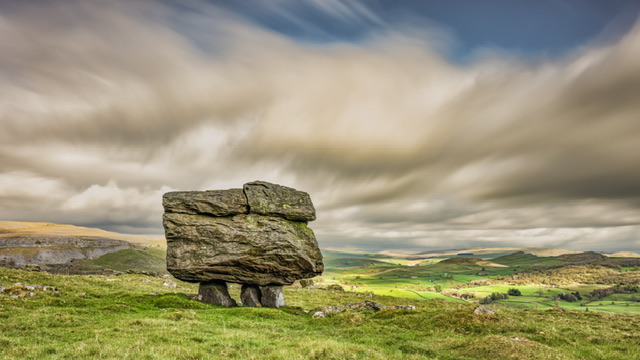 Dramatic Norber Erratic Scored 8.0 | Judge liked the sky which they said makes it. Considered the valley ‘soft’ | Maybe* | I cannot fathom how a background several miles is supposed to be sharp when it’s not to the human eye? With hindsight, perhaps I needed a different composition, but I would not shoot this any different in terms of depth of field. |
| Digital R2 Themed (On the Street) |  Classic Lisbon Scored 8.0 | Judge liked the composition but did not know the purpose of the image. | Yes | This was a postcard shot and I regret choosing this for competition. I think I was lucky to get an 8/10. |
| Digital R2 Free choice | 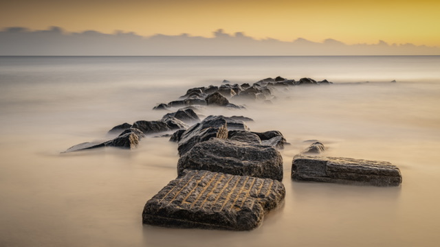 Alligator Rock Norfolk Coast Scored 10 | Judge liked the curvature of the rock, and the smoothed out water. | No | This was a very ‘clean’ image and until my wife saw it, I didn’t realise the alligator shape! |
| Digital R3 Themed (Seeing Double) |  Coastal Reflections Scored 8.0 | Judge didn’t mind the central position of the structure. They liked the reflections but the contrails in the sky were an issue. | Yes | I cocked up here but with ignorance, as I’ve never thought to consider removing the contrails. I was gutted as I felt this image would get more. A sweetener is a revised version will be on show at the club Exhibition in August 2024. 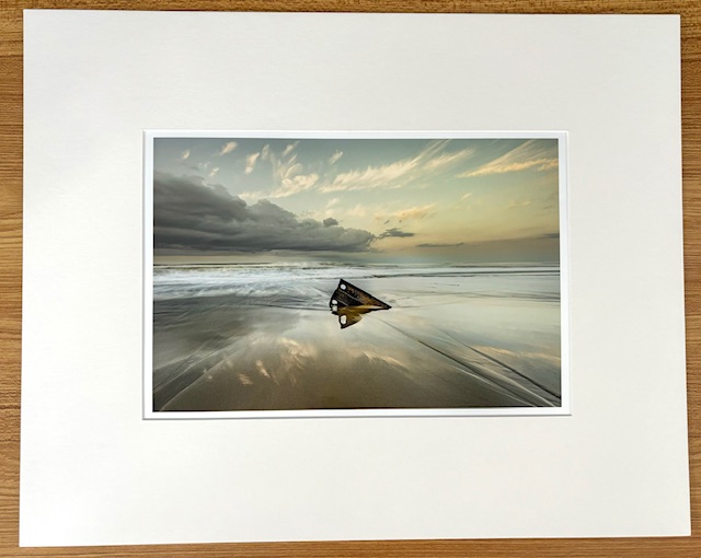 |
| Digital R3 Free choice | 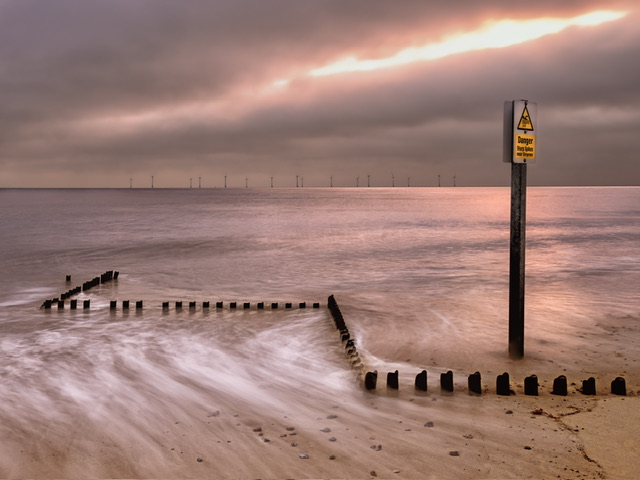 Danger Danger Scored 8.5 | Judge said this was well seen, and they liked the zigzag structure. They didn’t like the overexposed light at top and would’ve cropped it out. | Yes | I cocked up this image as my social media edit had a lightning streak for which I significantly reduced and controlled the exposure. I am lucky to have got 8.5. Kicking myself because if I had controlled that part and maybe given it a better name, I am convinced it could do better. |
| Digital R4 Themed (Colours) | 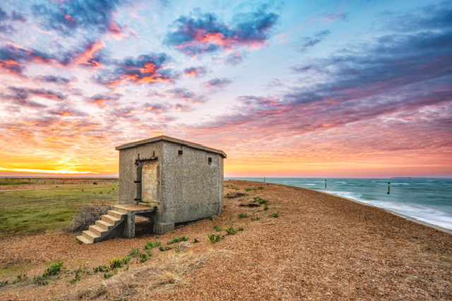 Sunrise Colours at Landguard Scored 9.5 | Judge liked the colours, especially the sky. They felt the doorway of the bunker ugly and wondered if some editing would improve it. | Yes | I agree with the judge, and have subsequently edited this image to tidy the blocked in doorway. While I was doing that, I noticed a gap under the staircase which I’ve cloned out too. 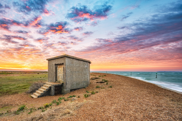 |
| Digital R4 Free choice | 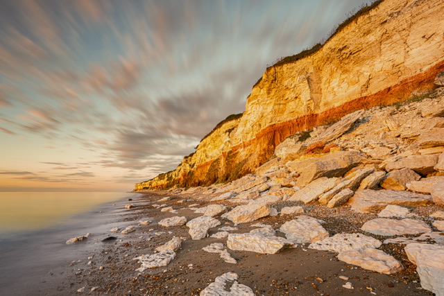 Sunset at Sunny Hunny Scored 8.5 | Judge liked the angle, the rocks and the colours. They would’ve liked a person or figure in the scene for a sense of scale. | Yes* | I really thought this would get more. *Other than planting a stock figure in this scene, which perhaps I can think about it in future, this is how the scene looked on the evening. |
| Digital R5 Themed (Monochrome) | 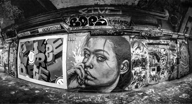 London Street Art Scored 10 | Judge liked the portrait and letters and said they liked that the image was ‘punchy’. | No | I was lucky to have watched a tutorial on converting images from colour to mono. Also fortunate was that I took the image with a new fisheye lens, which gave it something extra. Perhaps fortunate that the judge didn’t mind me “presenting someone else’s art”! |
| Digital R5 Free choice | 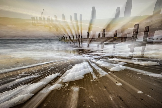 Abstract Seascape Scored 8 | Judge liked the concept of this image but felt it was the wrong subject for an ICM and the colour tones were odd. | Yes | ICM images are always a risk for competitions. With hindsight, I may not have entered this at all. However, it depends how many other images you have to hand that could be good enough for compeition. |
| Print R1 Themed (Contrasts) |  City Windows Scored 8 | Judge liked the repeating patterns, the detail in the blacks but criticised there being no focal end point for the viewer’s eye, e.g. an open window at top. | No | The judge just didn’t like this image at all. You could tell by their demeanour as they critiqued it. |
| Print R1 Free choice | 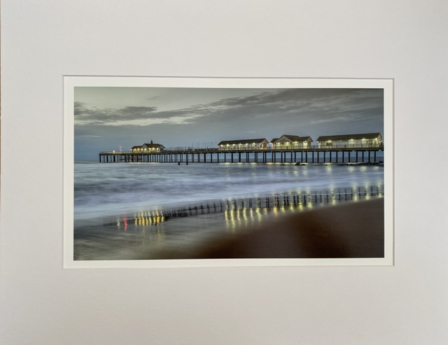 Blue Hour Morning at Southwold Scored 8 | Judge liked the scene, the colours and the wet sand, but said bugger all to explain the score. | Maybe* | *With hindsight, perhaps this image just wasn’t good enough for a competition. Of little value is the ‘something different’ factor with the blue hour and reflections of the lights. |
| Print R2 Themed (Urban Jungle) |  Urban Jungle Italian Style Scored 9 | Judge liked the plantations, the flag, and even the AirCon unit. | No | Given the effort I went to in producing this image, I wouldn’t have done anything different. If only the judge knew what I had to do from the original image. I think it could’ve got a bit more but given many fellow photographers got battered with a 5/10 score because the judge went a bit OTT on meeting the theme brief, so I fared well. |
| Print R2 Free choice | 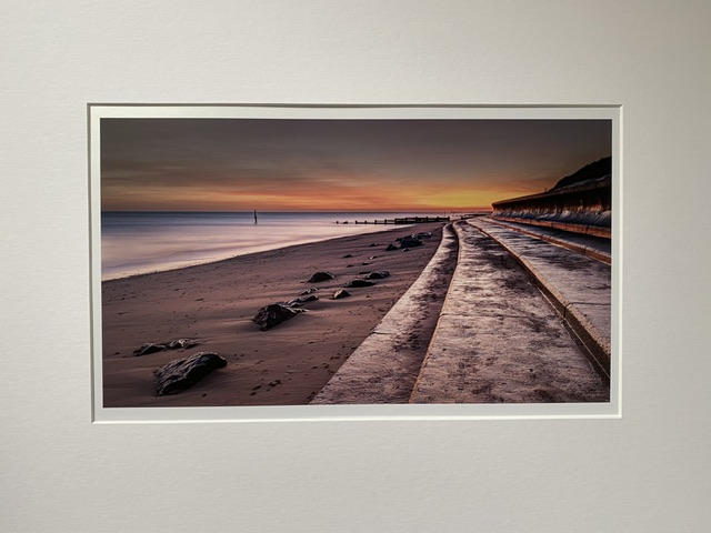 Sunrise at Cart Gap Norfolk Scored 8.5 | The judge liked this shot but seemed to think it would better in a club competition somewhere else in the UK where it would (apparently) get a “Wow”! | Maybe* | *Perhaps I should’ve chosen a different image but if the judge hadn’t been from Norfolk, perhaps the image might have scored better. |
| Print R3 Themed (Taken in Norfolk) |  Thornham at High Tide Scored 8.5 | The judge liked the leading line of the posts and the sky but wanted a boat or something in the background. | Yes | I don’t think this image stacked up well enough (composition, impact) for competition. It looks great in a frame on the wall though… 😛 |
| Print R3 Free choice | 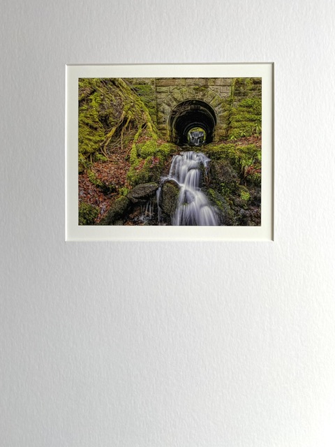 Waterfall within a waterfall Scored 8 | The judge liked the slow shutter speed to create the water effect and the rocks. They claimed they couldn’t see the other waterfall. | Yes | I don’t think this image was good enough for competition, or certainly not this composition. I let my emotional attachment overrule anything else. |
| Print Panel 1 | 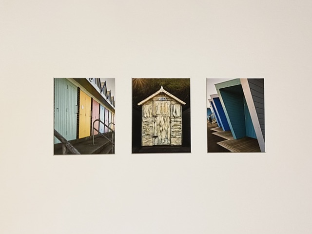 The Beach Huts of Lowestoft Shortlisted in final eight. | Judge liked the simplicity of this panel and the colours. They found the hut and staircase in the background of the right image distracting. | Yes* | I’m pleased to have got a panel though to the last eight. *The only thing I could’ve done is pay more attention to the image on the right of the panel, spotted the distraction and removed it. |
| Print Panel 2 | 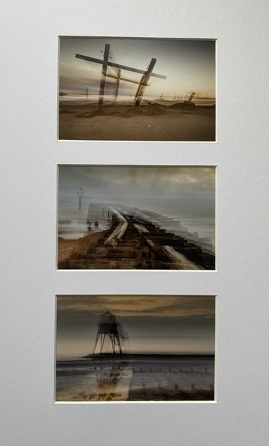 Not shortlisted | Judge did not like ICM shots, they said as much. | Yes | As I’ve said before, ICM images are a gamble. Also, the original mock up of these three images were horizontally placed, and I didn’t rethink the sequence when I realised the sizing meant they needed to be vertical – wouldn’t have made any difference this time round. I think this set of images were too much of a gamble. |
| Image of the Year entry 1 (Digital) | 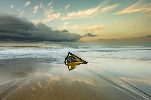 Coastal Reflections – revised (free entry) Not shortlisted | Judge liked this image and the colours, but said nothing else. | Yes | I don’t think this image was a suitable entry for an image of the year competition. |
| Image of the Year entry 2 (Digital) | London Street Art (qualifying entry) Not shortlisted | Judge liked the bend in the wall and monochrome but said these images present other people’s artwork. | Yes | I don’t think this image was a suitable entry for an image of the year competition. |
| Image of the Year entry 3 (Print) | 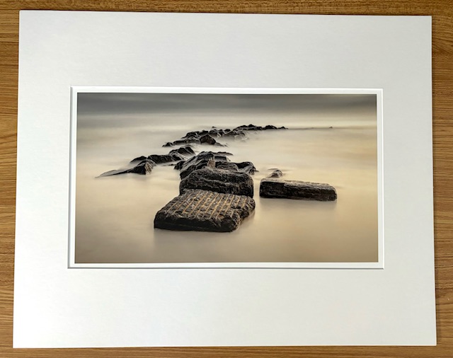 Alligator Rock (free entry) Not shortlisted | Judge liked the shape and capture as well as the golden colours in the rock at the front. | *Maybe | *I don’t think this image was a suitable entry for an image of the year competition. It’s a good image but doesn’t have the impact to be a contender. However, its simplicity and ‘clean’ capture has much going for it but there’s now “Wow”. |
Learning
Here is what I’ve learnt…
From 18 images, how many would I have done differently if I knew then what I know now?
- 10 images I would change, e.g. Not enter them or do something different
- 4 images I would potentially change, I.e A “maybe”
- 4 images I would not change anything
What specific things would I think about?
- Think about where the viewer’s eye will travel in your image – will they have interest to move around and return to the start? Will there be a natural end for the eye?
- Is the image good enough for a competition?
- Try and think about a competition image when shooting or before
- Consider what composition would deliver more impact
- Don’t use shots that you like and/or are emotionally attached to – take a look at such shots after a decent pause (days/weeks)
- Get rid of unwanted or ugly distractions, e.g. contrails / building elements
- Do something with overexposed areas, e.g. skies, although obvious try not to have overexposed parts in the first place
- Consider if you need something to demonstrate scale
- Don’t use images that are ICM – it will reduce the likelihood of a top score
- Regarding panels, I would think about the theme and how the images are put together
And there we have it.
For next season, there are major changes to the club competitions.
There will be fewer rounds, fewer themed categories and some critique evenings. I am therefore unsure as to how I will measure my progress as a photographer without the cumulative scoring.
I guess I will be aiming to win individual rounds.
Onwards and upwards…