The Theme
The final round of the five digital image rounds competition was ‘open call monochrome’.
Theme brief
There is no explicit theme – you are being given the freedom to inspire with your photography, no matter the style, subject matter or genre but the image must be presented in monochrome.
Entries must be taken in the last twelve months prior to submission deadline. No colour images allowed!
Themed Image (Monochrome): London Street Art
It took me quite some time to pinpoint an image I was happy with – early on, I was keen on the half plug hole shot from the recent Peak District trip.
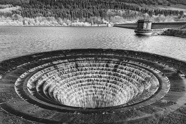
A fellow photographer pointed out some flaws in that image so I went back to look at my catalogue again.
Confinement to the last twelve months is limiting choices, but to be fair, given the volume of trips out I’m now doing, I felt there would be something I could work with for submission.
I happened to catch a webinar on editing images for monochrome by pro photographer Jonathan Vaines.
He had delivered a presentation at the club recently which many (including myself) felt was one of the best for quite some time.
This online tutorial made me look at some images in a different light – no pun intended.
One of the main fundamental learning points from that webinar was that, contrary to what many may assume, a colourful image will usually make an excellent monochrome conversion.
I choose the following image from Leake Street in London, and I realise this image, or variations could easily have been entries in the earlier colours round.
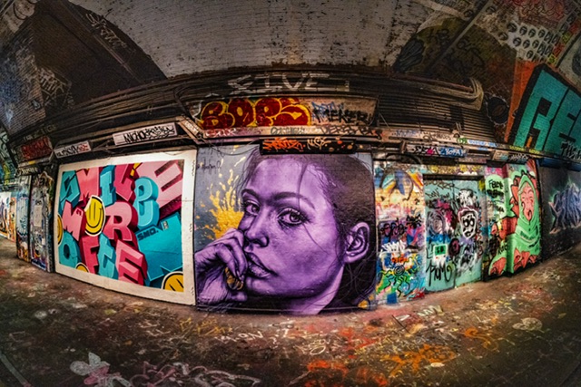
This image was shot using a TTArtisan 11mm Fisheye Lens at 11mm (obviously), f/8, 1/80sec, ISO 200, manual focus.
This lens does not record some EXIF data such as aperture or focal length although the latter of course is always 11mm.
As I wrote in previous blogs Testing a Fisheye a lens in Pakefield and London Snaps, I was able to easily manually focus by turning the focus ring to infinity and just checking each shot that the manual focus ring was fully turned.
I had a low focus peaking set which meant I had a little assurance if I needed it.
My experience with this lens was that focus was always spot on, and the overall experience shooting with this lens is a real pleasure – the ‘bang for buck’ here has been excellent.
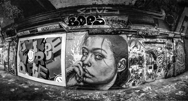
Below is the final submitted monochrome version which I’ll explain how I got to this final version.
Why this shot?
The Jonathan Vaines webinar on monochrome conversions came just at the right time. I got an email advertising Photo247 and the weekly free webinar was this one.
The webinar was incredibly informative especially those not in the know about converting photos to mono and really bringing out the best in such an image.
The main learning points for me where:
- A good mono image isn’t dialling the colour/saturation down to zero and cranking up the contrast – I’ve done this to date, although I have most recently been using Nik Silver Efex
- Altering the colour channels is how you create different dark and light areas therefore, contrary to what many may think, a colour rich saturated image will be very good in mono
- There are quite a few different techniques, and some work better on specific types of image
Effectively, the webinar led me to looking at a range of alternate images I’d not thought beforehand to look at and consider for monochrome.
After twenty to thirty or so images were reviewed, converted and inspected, this one kept making the grade.
Post-production editing
As usual, I took a virtual copy in Lightroom, then reset back to redo basic edits then it went into Photoshop to follow one or two of the specific techniques taught in the webinar.
It was stated that Nik Silver Efex is a shortcut to many of the techniques, not all of them and doing it yourself offers a finer level of adjustment.
So I played around with the colour channels and then when the image looked as striking as I could get it, the image went back to Lightroom for final tweaks.
The image was cropped to ensure the portrait and block lettering was more dominant, and a little less of the left and right hand edges visible as they provided partial wall detail.
I didn’t want to crop too much as I felt the curve-effect of the fisheye added to the impact and interest of the image and didn’t want to lose any of it.
Self-critique (pre-judging)
On the face of it, this image could be seen as a snap of a graffiti wall. It sort of is I suppose but a hell of a lot of work has gone in to get it to this stage.
With obvious bias, I really do have high hopes of busting well past the 8 ceiling. Hang on, this time round I’m abandoning modesty and reality. I want a friggin’ ten please….!
Firstly, the image immediately has impact with the portrait of the woman. Then your eye spots the square shaped lettering on the left showing the different tones of the blacks and whites.
The use of a fisheye lens enables a very wide and distorted view which provides lots of detail, and the image has lots of interest for the eye to wander.
There could be criticism of the distortion but a straight on capture would have less impact, and I think the distortion provided by the fisheye lens really suits an image of a wall.
Now I’m looking again a few days after submission, I think I could’ve cropped in to make the portrait and lettering graphic larger.
However, cropping off the right hand side would reduce the view of a wall in a street but I do think this could be the main area of criticism. I’ve walked into it above with my description of where the viewers eye travels!
I can hear it know.. “If the author had cropped in, we could see more of the woman’s face and lettering and it would make it the main elements of the scene.”
There could be criticism of the dark floor to the bottom left compared to the brighter and detailed right hand bottom side, but this is how it was! I can see there could be criticism of the top area with dark spots.
However, I took a lot of time to ensure these are not blown or burn out spots to the eye, but also that any bright detailed illustrations are not distracting as I want the viewer’s eye to remain on the main subjects on the wall.
There could be criticism that I could’ve cropped tighter top and even bottom too but I went as far as I felt I could go without it losing the context of being a wall or in a dark place.
As I’ve found to my cost and supposition, it could be a capture that just doesn’t float the boat of the judge.
I’ve done my best here, and can do no more.
Judge’s Verdict
The judge said they thought this image was from Leake Street, near Waterloo in London. Correct.
They said they were familiar with the location, and have visited it many times, and have always been astounded by the quality of the artwork on display, which is constantly changing. The judge recommends this as a place to visit if you’re in London.
The judge said this image gives a very good rendition. They said they know the obvious thing is that artwork is somebody else’s artwork, but you’ve got to convey that artwork to us and they thought this image does that very well.
They liked the fact that you’ve got that face in the centre, the portrait of the person. The eyes really do hold you and then you sort of look around, you look at other things, you look at the lettering.
They quite liked the lettering in the panel to the left, the jumble of letters – much more organised and recognisable than the images to the right hand side of the picture.
They said because of the lens used, you’ve got this beautiful curvature, so they know this is a flat wall, and you’ve got a bending line so it gives us another dimension in, so we’re coming round a curve.
The judge continued by saying how we’re travelling in from the left perhaps, passing this woman in the centre and going on the right hand side and that’s where we tend to travel.
They said even the immediate foreground is filled with the sort of bits and pieces of debris with former paintwork made on the floor so they thought this was a good image.
The judge said this is a strong punchy image with good contrast and well controlled, and they held the image back.
In the held back judging section, this image and one other was up as a potential winner.
The judge said they liked the punchiness of this image, the presentation, and that it was a great image.
The other image got a 9.5 and my image won the round with 10/10.
Post-judging thoughts
I put a lot of effort into learning how to convert a monochrome image with impact, although the webinar sprang up almost by fate’s hand just at the right time.
I took care in selecting an image I felt would deliver impact. I had my doubts, and went through editing about 30+ other images before I realised this one repeatedly made the shortlist.
The hard work paid off, and I’m well chuffed!
With top marks and winning the round, of course I’m thrilled to have won it.
Free choice image: Abstract Seascape
For my free choice image, I was initially obsessing over a handheld ICM shot from East Ruston, convincing myself it was so abstract and arty that it will bag a ten.
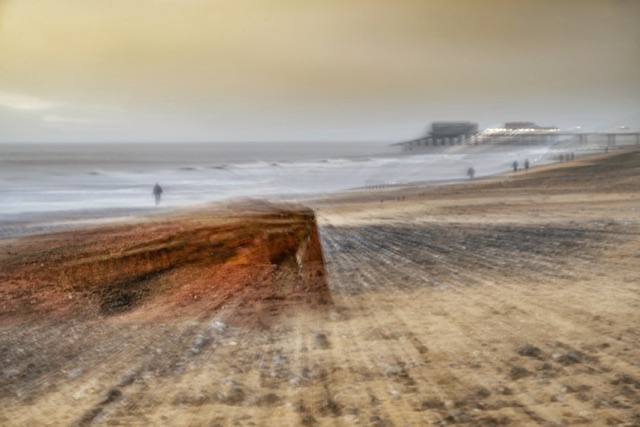
After lots of thinking, seeking opinions from a few folks, and angst, I abandoned that image for something else.
I was getting sucked into choosing an image to be different, more ‘arty’ and there’s still a curiosity with me that wonders how the image above would fare? Then I think there’s possibly even more subjective risk to such images.
I changed my mind and went with an image I’ve been wanting to punt in for some time – see below:
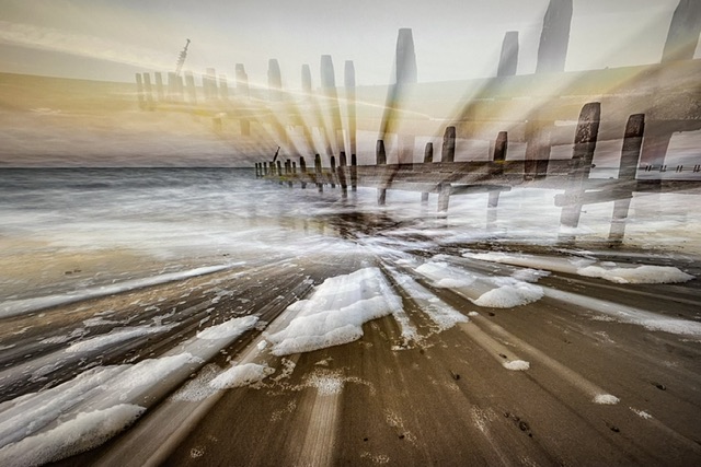
Why this shot?
This is an image from a fantastic sunset evening shoot at Happisburgh.
Of course, it could be anywhere and it’s why I haven’t bothered putting the location in the title.
I’ve put it in because I d always liked it and been wanting to throw it in a competition for quite a while.
Anyone who has read a few of my competition blogs will know immediately this is where it can go wrong big time. Using images you love, rather than what may please a judge.
Post-production editing
There wasn’t a huge amount to do to this image.
Following a critique by a fellow photographer, toned down the over-saturated orange and blue colours.
The image went through Nik Colour Efex and I just removed a few small distractions in the foreground.
Self-critique (pre-judging)
I think the overall image is very accomplished – it’s a decent ICM image with impact. A sort of exploding diagram image.
I’ve always liked the foam too, as I think it adds more interest.
I had a work colleague telling me they felt this image could be an album cover/poster – that may have been the comment that sealed the deal.
What could be criticised?
As always the judge may not like these types of images.
They may say they feel it would be stronger in monochrome which I disagree with entirely. They may want more colour, or more contrast but I think it’s just right as-is.
They may moan about the contrails in the sky but they are horizontal and I couldn’t clone them out cleanly so they’ve been left in.
I have wondered if a lack of location in the title will be criticised since it could be anywhere and may lead to question of so what? What is the story here?
To be honest, a lot of ICM is down to luck as to how the images emerge. It’s an art form more down to hoping you get your intended effect.
I’m stating the above as if I know, or I have expertise of significant standing in that style of art, which I do not. Hang on, I’m judging…!
I really don’t know what this image will get. Is it a ten? Not sure, it’s definitely an eight IMHO, maybe a little more.
Judge’s Verdict
The judge had obviously seen a Landguard shot earlier and wondered if this was another one but realised it was not.
However, the previous image led them to comment this was not as strong as that, and not as powerful.
They said the idea was similar, a wooden structure going into the sea, and this sort of foam in the foreground and a little bit of streaking on the beach.
They assumed is was a zoom during exposure, where you get this explosion that’s coming out from the centre. [Correct, a zoom burst.]
They commented that these days, if you don’t do it in camera, in lens, the you can do it in Photoshop using radial blur, so it just comes out of the centre, in fact you can control where it comes out from.
They said they found a little bit odd is the sort of spectrum colour, the halo colour, the yellows going through the centre where the bar runs right through the top of the image or about a third of the way down.
They said there was quite a lot of different sort of colouration in there, which seems a little bit at odds with everything else around it.
The judge said you’ve got a spectrum which is sort of blue in the water, and then it goes into red on the horizon and goes off into yellows before goes off into the pale blues beyond, so it’s a bit of an oddity in terms of the colour.
They quite liked the idea, and encourage me to carry on trying this sort of thing but they didn’t think this is the object to do it with, because it has got so many straight lines horizontally and vertically and becomes a little bit confusing.
They said full marks for giving it a go and awarded the image an 8/10 for my endeavours.
Post-judging thoughts
I’m not totally surprised by the outcome from this image as I had known it to be a risk.
There’s an element of subjectiveness in terms of the output of an ICM image.
I have no idea about the colour spectrum, but it’s interesting that I had really toned down the colours, almost feeling as though I’d overdone it.
I can see what the judge means and I think their comments are fair.
I’m a little disappointed in myself in that I knew this image wasn’t a ten. But I think with hindsight and with this round done and dusted, I can reflect on some of the reasons I let it go forward:
- I put so much effort into the themed image, I put less effort (or certainly proportionally a lot less of my time) into the free-choice image
- I allowed my opinion and feelings to dictate things again
- I took a gamble on this image (although to be fair, if I don’t, I will never get the feedback and learn)
- I could have potentially put alternative images in, but I’m unsure they would’ve done much better
- With sixteen images submitted to date in this season, it’s easy to rapidly reach a low tank of your best images
Overall, the eight is within the range of what I had predicted, perhaps at the lower end, but it keeps my eight or higher scoring across all competitions and rounds (sixteen images in total) intact, which is an achievement I can be proud of in terms of maintaining a standard.
Reflections
Effort expended for competitions
This is the last of the five digital image rounds having recently competed the three print rounds. That’s sixteen images in total I’ve needed to choose, edit, produce and submit.
Achievement ~ “punching”
Digital competition f5.6 league
From the five digital rounds (ten images), I’ve scored a total of 87 which means an average score of 8.7 per image. Not too shabby, not enough to win POTY but what about my league?
I really wanted to win my league in the digital competition, but I knew there were other members who had got good scores, and at least one in particular who was ahead of me.
Edit: Official results have now been announced and I achieved third place, 1.0-1.5 points behind the winner and runner-up.
Final thoughts
I’ve ended the digital image competition in this final round strongly with 18/20 (90%) which is a good result.
Edit: I’ve finished third out of fifteen participating members in my league, which demonstrates improvement.
I have an overall POTY score so far of 137.0 from sixteen images which means an average score of 8.6 per image which is pretty decent.
My achievements to date this season have surpassed anything in previous seasons.
The final individual competitions are the print panel and image of the year which are open to members from both leagues with each offering winner and runner-up awards as well as contributing to photographer of the year.
I will be interested to see how I finish this season in those two final competitions, especially in the print panel competition, as this will be the first time I’ve compiled and produced a panel.
I will also be interested in how I fare overall in POTY against other photographers in the club, and I’d love to make the top ten.
Whether or not you can bear it, there will inevitably be blogs posted in due course for me to reflect, whine, be self-indulgent, and wallow in my own pathetic self-pity.
I very much looking forward to writing and sharing! 😄
Onwards and upwards…