The Theme
Theme Brief
There are no restrictions on any genre of photography, but it should be evident to most viewers who are familiar with Norfolk where the photograph was taken.
The brief anticipates huge beaches with wonderful wildlife, quiet ancient woodlands carpeted with wild flowers, and the beautiful ever-changing Norfolk Broads. The city of Norwich (culture and heritage), shops, quaint and quirky market towns, busy coastal resorts and fishing ports.
One constraint is that the image must be taken in the previous twelve months.
Images can be either colour or monochrome.
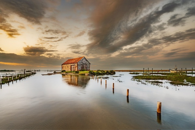
Themed Image (Taken in Norfolk): Thornham at High Tide
I took quite a while deciding what image I would focus on for this round.
I had some Happisburgh shots I quite liked but there are most likely going to be a few of those. A few of the guys and I had exchanged information on our likely images.
I had inadvertently deployed two of my Norfolk images very recently with Cart Cap and Hunstanton shots so I didn’t have loads to choose from, but in the end, I chose a shot from Thornham.

I reviewed this image and although I like it, and especially like the marks on the top of the water, the sky looks quite bland.
Lucky for me, I had a few other shots and after much deliberating, choose the shot below.
Why this shot?
Several reasons led me to this shot. It’s a recognisable place. It’s got a lot going for it. Nice sky, nice scene, leading lines. And I didn’t have a huge selection from Norfolk.
In fact, I realised I’ve got more shots in my locker from Suffolk. A lot of good that is eh? 🙄
How and when did I take this shot?
I took this shot during a group sunset trip to Thornham in September 2023.
We had targeted this location due to a very high tide as there are some great shots to be had when the road is flooded as it isolates the coal barn.
Post-production editing
As mentioned above, I changed the image chosen due to the better sky.
I took a virtual copy in Lightroom, reset and started the edit from scratch.
After a consult with a fellow photographer who advised me that sky was too warm versus the water and didn’t balance, and that I could crop some of the sky out, I did some more editing.
On the back of that critique, I toned down the warmth in the sky and did a free range crop to reduce the amount of sky.

As a final tweak, I cloned out some of the sky in the top left as the original image had too much blank sky, not blown out but no cloud.
I was really pleased with the final image.
Printing and Mounting
I went straight to one of my recently discovered and immediate favourite papers Permajet Titanium Lustre 280.
It looked really good on this paper and I went straight to cutting the mount to size.
I also put a key line on the image before printing as felt I need to start doing this as a regular addition given one of the recent judging rounds where the judge obsessed about it.

The image is mounted higher up on the mount and the crop leans towards a letterbox shape.
Self-critique (pre-judging)
I think this image is a very pleasing capture and the print works very well on the metallic paper.
There is detail in the sky and it’s balanced fine with the water, and there is a leading line, well one each side.
There’s some detail / subtle ripples in the water in the foreground.
While I mention the water, I’m a little worried about the water in the middle part of the image which has no detail, and takes up a lot of space, almost providing too much space.
My other concern is the whether or not the reflection of the coal barn will be seen as too strong with an accusation of over-processing.
I have some doubts over this image, and I did think about picking something else, but I had printed and mounted it, and with little other Norfolk images in last twelve months and not wanting to punt in a Happisburgh shot, I committed to this image.
I think the only other image I could’ve picked is one from How Hill.
I hope this shot maintains my minimum 8/10 score to date, and think it will do well to get that or maybe up to 9/10 but I don’t envisage it getting top marks.
Judge’s Verdict
The judge said this image was taken at a good time of day and was well executed.
They said the posts on the right hand side was a good leading line up to the building, and observed posts on the left hand side, which both draw the viewers eye in.
With reference to those posts on the left, they said your eye leads to the back of the image and they would’ve liked a boat or something of interest there.
They said they wondered if a warmer colour tone would improve the image and overall it was well presented.
The image was scored 8.5/10.
Post-judging thoughts
It was interesting the judge felt the colour temperature could’ve been warmer as I had toned that down from the original social media rough and ready edit, maybe too much so.
I do think the image lacks a punch, but finding a balance between punch and overworked is always a challenge. Maybe it’s the classic reference shot? A postcard, a scene, a snap?
There was no boat in the scene in the distance so to coin a phrase, it is what it is… although I have subsequently spotted that there was a boat in the original edit for social media but on the right hand side. Would not cropping have made it a stronger composition? We shall never know!
Given my own critique earlier, I’ve got no grumbles about the score or the judging of this image.
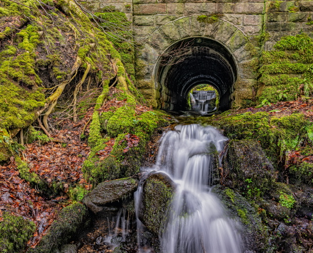
Free choice image: Waterfall within a Waterfall
For my free-choice, I chose a shot from recent trip to the Peak District – see here.

Why this shot?
After the recent epic two day trip to the Peak District, and the decent yield of good quality images, it felt a good bet to consider something from that batch.
I chose the image of a waterfall with water running out of a culvert.
How and when did I take this shot?
The image was taken in March 2024 – the how, when and why is in my blog here.
Post-production editing
As always a virtual copy and re-edit took place.
There then followed a standard process of basic editing but I did quite a lot of cloning out distracting branches.
I asked Pat who was with me when I took the image to critique it. He advised me to choose another capture of this in landscape orientation.
He also advised removing anything of the bottom of the tree trunk on the left as well as some of the tunnel wall above the entrance.
We had a few debates about the crop, and in the end I went almost but not quite square.
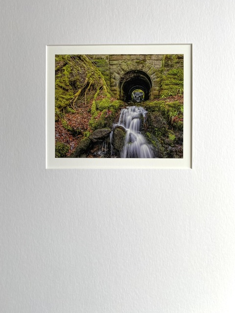
Printing and Mounting
Printing would’ve been on my other ‘go to’ paper of Permajet Portrait White but I ran out so used some stock Fotospeed Smooth Cottom 300 which also has a bit of texture.
I decided to mount this image as a portrait mount and not to have too large a print to draw the viewer’s eye in.
Self-critique (pre-judging)
I love this image and think it’s got a lot of interest – I’d be gutted if it didn’t achieve a minimum of 8/10, maybe a 9/10.
It’s been a while since I printed and mounted this image which has given me more time to reflect.
I think the potential for criticism is quite a bit.
The size of the image and crop could well not suit a judge’s eye.
My main concern is related to the title I’ve chosen… if there’s a waterfall within a waterfall, it’s not strictly that. Plus it’s very small at the back of the tunnel. I think this potential error of judgement on my part could cost me.
On the other hand, the viewer has to hunt for the second waterfall, and go looking which could be a positive in providing more interest. Oh, f*** knows!
The main point is that this shot is epic, and that’s my judgement! 10/10 from me – I thank you!
Judge’s Verdict
The judge said this shot was well executed – they said a slow shutter speed achieved motion blur in the waterfall which leads the eye upwards.
They said the water effect also highlights the details in the rocks.
They said the title was interesting, that titles can be influential and the title of this image made them look closer as they hadn’t originally seen the waterfall at the back of the tunnel.
They said the tree on the left also leads the eye upwards.
The image was awarded 8/10.
Post-judging thoughts
My initial reaction was disappointment, especially as I had hoped and assumed this image would score more than the Thornham shot.
Talking to Pat who was with me when I captured it, he said it’s a great image. On chatting more about it, I think we agreed we find it awesome! Why? Well as is often the case, the image is special to us, we were there, we grafted to get to this location and worked it.
My concerns about the title appear well founded. Although I think the judge paid me a compliment about it, I think it was a double-edged sword. The title made them look closer to see the waterfall at the back of the tunnel.
The title also means perhaps I could’ve scored worse had I not pointed it out from the title.
I think the tunnel and waterfall at back are probably too small. With hindsight, perhaps a larger print would’ve worked but I’m not convinced as I’ve received criticism in the past for simply filling almost all of the 50cm x 40cm mount, and I’m quite liking smaller images.
It’s disappointing that there was no critique to suggest improvement but my take is that, to the judge, without any of the emotion that I have about the image, is that this is just another waterfall slow exposure shot.
Judges have probably seen so many images like this, these scenes leave them cold.
With a more balanced outlook, and trying to leave my personal connection to this shot aside, it’s done well and I’ve little to complain about. It is to the eyes that were not there at time of capture, just another waterfall shot.
Reflections
The Judge
Compared to other judges, this one was better. They took plenty of time to describe their rationale for commentary on the prints.
They also took the trouble to comment on the print itself, having a particular eye for halos, colour casting issues, mount orientation/size, and choice of paper.
This was very much appreciated given that some previous judges have not referenced this at all, choosing instead to flaunt their perceived elevated status as a higher priority than helping and supporting aspiring photographers.
They were fair and reasonable and fairly frugal with the highest scores.
I could’ve done with a little more commentary on areas of improvement, but I do acknowledge that my free-choice image could’ve just switched them off.
I think the judge had a favour for monochrome images, and perhaps that’s one notch a more acceptable subjectiveness than preference for a particular genre.
It was interesting that most of the winning prints were monochrome or infra red which isn’t surprising.
Did the more experienced members or those in the know consider the judge’s penchant for mono ahead which influenced their image choices? I’m not sure. Does it matter?
If they did then it has two side thoughts. They are to be congratulated for being clever bastards and doing their homework. On the other hand, this is a notch higher in competitiveness which most members won’t think of, or can be bothered to consider, or may not have that intelligence to hand anyway.
The judge did end the evening with kind words… they reminded us all that a judge is offering up his/her opinion and that criticism can hurt. However, they encouraged us to take on-board any feedback and advice but not let judges comments change our photography completely.
They said we are all recording how we see the world, and it’s this variation which provides interest and should continue to do what bring us enjoyment. Quite rightly, these final words were well received.
Those words to me are most applicable to my waterfall shot.
Learning
Perhaps if the aim for success at competitions is something different, something out of thousands of others of the same, something that makes the viewer think, ponder, question, look for longer, then the penny that may have only dropped halfway has now dropped.
Will I change my choices and devoid myself of what I like, and leave my emotional connections aside? Of course not. I have an inkling that doing that risks reducing my enjoyment or not being true to myself. However, I am uber-competitive so perhaps there’s room for both aspects and something to aim towards.
Scores and achievement level
At a combined score of 16.5/20 (82.5%), I’ve done well, perhaps a little under what I’d hoped for but I have maintained my minimum target of 8’s. Mustn’t grumble (as they say)!
This round concludes the print rounds so overall I’ve scored 50/60 (83%) which is not bad at all, and equates to an average score of 8.33 per image.
I would imagine insufficient to win the print competition but decent enough to be in the top half of the pack.
Edit: The club have now published the results and named the top six scoring members so I am very pleased to have bagged sixth place.
So what I hear you say? Well, on looking a bit closer for some perspective, it looks like 21 members entered prints and of those 21 members, 13 submitted prints for all three rounds (6 prints total).
For me, that’s an achievement competing against more experienced photographers and printers, and those members across both leagues. The other five members are all from the higher league including former POTY winners.
The table below provides a little more analysis, and also shows that there’s a 5.4 score gap between me and the winner across six prints which is quite a gap. It demonstrates the high standards needed to win one of these competitions.
| Member Position | Cumulative Score | Overall % | Average Score Per Print |
| Winner | 55.5 | 92% | 9.2 |
| 2nd | 54.5 | 91% | 9.1 |
| 3rd | 54.0 | 90% | 9.0 |
| 4th | 53.5 | 89% | 8.9 |
| 5th | 52.0 | 87% | 8.7 |
| Me | 50.0 | 83% | 8.3 |
Final thoughts
The main learning point is repeated – my images are rated as “technically competent” (a favourite phrase with judges) but they need to have more impact to the viewing eyes.
Onwards and upwards…