Print League Round 2 Theme: Urban Jungle
The Theme
The objective of this round is to encourage members to document the interplay between architecture and nature in urban settings.
Whether it’s the lush greenery peeking through concrete structures, vertical gardens adorning skyscrapers, or the cohabitation of urban wildlife with the built environment, members are to capture the spirit of the “Urban Jungle, and to show the unique blend of human creativity and the raw power of nature as they converge within the urban landscape.
Hopes, aspirations, expectations, objectives, aims…
My aspiration remains to score more than 8 and into the 9-10 bracket on a more consistent basis.
If I’m honest, I felt the image I submitted for the theme could score well or it could be butchered.
I said from the off I struggled, and did not go out to any other places at home to try and get something more obvious, nor did I have anything in my library already.
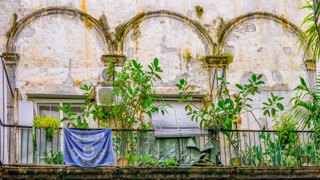
Themed Image (Urban Jungle): Urban Jungle Italian Style
The finished image is below:
Why this shot?
I foresaw that I may struggle with this theme but I knew the trip to Italy may well offer some opportunities.
I pretty much knew the day I got this shot that it would be the one.
How and when did I take this shot?
I got this shot on our third and final day in Naples in November 2023 as we were walking around and while exploring we went into a courtyard where this balcony caught my eye.
The original shot is from distance looking up and shown below:
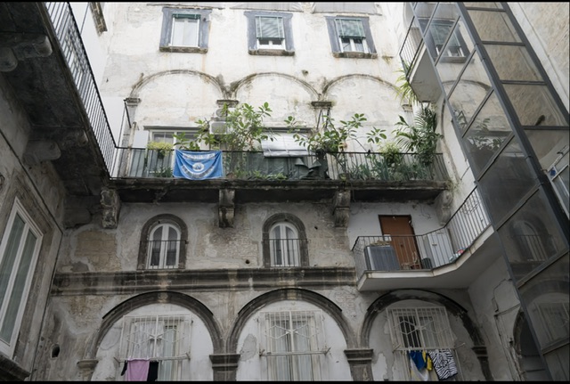
As you can see, I was limited to this view at distance looking upwards so the shot needed a lot of work to get from this to the final image. In fact, a hell of a lot of work!
Post-production (editing)
As always, a completely new edit from scratch was started by creating a virtual copy in Lightroom.
Since this shot was taken from afar with a 24MP camera, I decided to run the image with basic edits for exposure through Topaz Gigapixel to boost the pixel count in preparation for the heavy crop.
I could then crop in and use the Lightroom Tranform tool to change the geometry of the shot so that the balcony was a little straighter than the original capture shooting upwards and at distance.
A few more edits were done and I tried to clone out the vertical railing which I felt was distracting on the left hand edge. However, despite trying this in both Lightroom and Photoshop, the content-aware filters produced a messy output so I decided to leave it.
I then sent the image to the Nik Collection 6 Color Efex suite where I usually can’t help but try two of my favourite filters, one of which is usually chosen. I then applied a couple of other filters which improved the tone and lighting.
A bit more work on cropping and just a couple of distractions to clone out and we were done, and ready for printing.
Printing
My go to first try for paper was the newly discovered Permajet Portrait White which has a texture to it. This image looked great on that paper. I asked a fellow photographer for an opinion on this image and he advised to tone down the saturation of the blue flag.
I had the same advice from someone else, also suggesting changing the flag’s colour. I was never going to change the colour of a footy flag though, as it feels wrong.
I decided to make the print smaller than the usual size as I felt a smaller image may draw viewer’s eye in to look at the detail. Also, due to the heavy crop (no matter that pixels have been adjusted), a smaller image is more forgiving of lower resolution, or a judge being able to spot any artefacts caused by the upscaling.
I decided to reprint using a Fotospeed Smooth Cotton paper which has a more obvious texture, and really liked it.
Mount board production
I measured up the print and the required mounting aperture then went to work cutting the mount.
The finished mounted print is shown below:

Self-critique (pre-judging)
There is plenty of potential to criticise this scene.
Does it really meet the urban jungle theme?
With a domestic balcony scene, there are plenty of potted plants rather than anything naturally occurring.
There are lots of distractions or clutter in the shot including a ripped piece of material, air conditioning units, but it was unrealistic to clone all these things out.
Another view is that all of these items bring detail and character, and points of interest to the viewer.
An authentic scene with a bird on the balcony, a lemon tree, a Venetian blind, and a classic Italian looking wall, roughed up from years in the elements. What more can anyone ask for? Or is less more?
The flag may be seen as erroneous, or a nod to the place where the shot was taken, and a hint at part of the culture of those living here.
Judge’s Verdict
The judge warned at the start of the evening that they were going to strict about the theme, and read out the brief that had been published. They warned that other definitions of urban jungle (Collins Dictionary was quoted) would not meet the theme.
This had me worried… as some earlier images got scored a 5 for not meeting the theme, but it worked out well for me.
The judge liked the image and the wild plantation creeping out of the concrete, and much to my relief said that it met the theme.
They seemed to like the Naples flag and commented that they are wild too.
They even liked the air conditioning units further depicting the urban nature of the scene.
They said they would’ve liked the image a little more to the left. I can see what they mean but when you look at the original I had to work with, I’ll take that.
Much to my delight, the image scored a 9/10.
Post-judging thoughts
Given the strict judging of the theme, and all my concerns, I’m very pleased to have met my aim of breaking through the 8 ceiling.
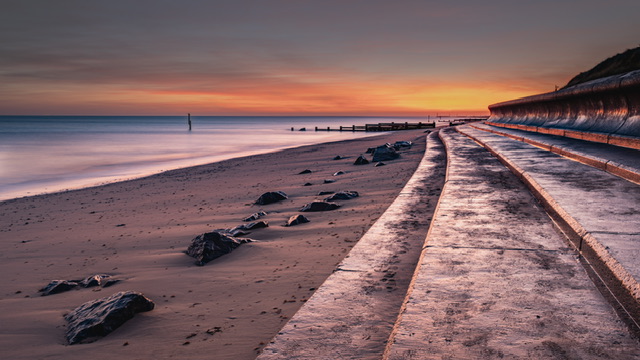
Free Choice Image: Sunrise at Cart Gap Norfolk
For my free choice, I was originally going to use a shot from Caister last year but on printing it, I didn’t think it was as good as I had hoped so went back to searching from my recent images.
I chose a recent sunrise shot from Cart Gap.
Why this shot?
I really like the colour tones of this image and the textures in the concrete wall and path, and felt it would suit a metallic paper.
Post-production (editing)
I had a lot more work to do getting to this final image than I first realised.
I used a couple of original captures, and ran the image through Topaz Denoise just to sharpen the rocks in the foreground.
I spent ages looking a different crops and wanted a tighter crop and to lose the post but neither Lightroom or Photoshop would remove it without me needing to try and lose some reflections or artefacts afterwards.
In the end, a 16:9 crop worked best even though I don’t like it as the best, but it avoids me needing to crop the post out.
I had a lot of issues with the bright sun on the horizon to the right of the image, as I was worried about clipped highlights.
A fellow photographer advised me to look at the print, and if there’s no ink on that part of the page, I will know it’s blown out.
In my original test print, there was a small streak of white so I decided to darken the sky and try my best to tone down that part of the sky.
Finally, I removed a few streaks in the sky, learning from the contrails comment in the last round.
Printing
As I mentioned earlier, I felt the Permajet Titanium Mettallic Lustre 280 paper would work well, and the print does look good on this paper.
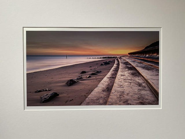
Mount board
I cut the mount to size and the final product is shown below:
Self-critique (pre-judging)
This image is a nice scene and has lovely colour tones.
The crop could be savaged I expect. There is a lot of space on the left hand side of the image.
I am not sure what else there is to criticise, and think it should get an 8 minimum, and arguably into the territory of a 9.
Judge’s Verdict
The judge said this was a recognisable location and in another part of the country would receive a “Wow”.
That was an interesting comment and I wasn’t the only one to receive it. Surely we’re judging an image on other aspects rather than whether someone recognises it or not? Are they asking what’s different about this version?
Anyway, they said they thought it was a lovely image.
They liked the curvature of the path and the details were good, and liked the post in the shot.
The image was scored at 8.5/10.
Post-judging thoughts
I’m content with the score, since I broke the 8 ceiling again.
Although I like the image, and was happy with it, I do agree it’s a recognisable location and scene, and offers little different to many other images of the same place.
It could be debated as to what a judge expects? Are we not to photograph the region we live in and create high quality enjoyable images from those locations?
How can I produce an image from my main genre which will score top marks?
To coin a phrase…. “I mustn’t grumble…”
Reflections
Themes
Despite my themed image meeting the brief, I felt bad for my fellow photography buddies who got landed with low scores (5’s for some) when in my view their image did meet the theme.
We were talking amongst ourselves about the punishment (seems the right word to use) for allegedly not meeting the theme.
Rather than dumping the image with a 5 score, it may have been fairer to critique the image and give it a score as if it had met the theme, then dock points for not meeting the theme.
The photographer on the rough end of that low score has no feedback on the image itself, and therefore it can appear a bit tedious just to concentrate on the theme and nothing else.
Consistency is key
There is also a point about consistency – to date this season, judges haven’t been as strict on the theme so perhaps some members have taken artistic license? Why wouldn’t they with what they’re witnessing with their own eyes and ears?
I myself have been witness to judges in the past scoring images high when they blatantly are nowhere near the theme whatsoever.
This has been irritating when you go to the effort yourself of trying to fit in with the theme and if others are scoring 10s or high marks on a great image that’s nothing to do with the theme, then the rest of us could’ve done the same!
We seem to have leapt from a loose following of the theme to an uber-strict Caesar-style thumb up/thumb down mode which has resulted in a rather unfortunate, unjust, unfair, inconsistent, and demotivating outcome.
Wider implications
The other factor for the club is that we have less members entering the print competitions, so do not want to demotivate or discourage those members who go to the effort of printing to not participate in future.
It’s a “Print Round”
Another observation was that, given that this was a print round, we had nothing much about the prints themselves. There was one comment on a keyline addition to a mono print, and a couple of prints received comments about their mounting orientation, but nothing said about paper type or the output of the image to print.
I concede this may be a petty observation since we want the images critiqued for the view they are portraying. However, the club promotes a print round and therefore it wouldn’t be wild to expect a little more critique on the printing as well as the image, even if it was to say it had been produced competently.
Judges, and in-house judges in particular
It’s OK to have a qualified member undertake the judging (and especially if we’re struggling to get external judges), but when judging (and especially more than a one-off round), it probably carries higher risk of conflicting views or their preferences being dominant.
Asking a club member to judge a club competition also attracts suspicion of bias towards friends of the judge for whom they know and like their style of image making.
To be fair, there was one image the judge declared they had seen it before, knew about it and how it was done. They declared this and said the proposal was to score it as an average across all the other scores.
However, all bar one of the final held back images in round two would carry those suspicions. Those suspicions may well be unfounded, unfair, and potentially offensive to the judge and their friends.
But such suspicions would rarely even cross the minds of anyone with an external judge presiding over the assessment and scoring of our images.
There would little to no risk of a conflict of interest, or the perception thereof.
The struggle to sign up judges
Some of us wondered that if we continue to struggle for judges, whether or not asking the membership on the night to score the images themselves, and combine all the scores to create an average of the total score for each image would result in a fairer outcome.
Whether or not that would work, I have no idea. It probably wouldn’t as I’m not sure if we’d ever get a “ten”?
But it doesn’t matter, a single judge is how it’s done. And rules are rules! Although what we’re observing is variation within the rules which then becomes a source of frustration for all concerned.
I’m sure we’re not the only club to experience these things, and that there are opportunities for refinement and improvement.
My position
I scored 17.5/20 (87.5%) overall so more than happy with that.
In summary, I did well and competitions are a selfish affair so there we go.
Onwards and upwards…