POTY Digital League Round 3 (Theme: Seeing Double).
The Theme
Below is a summary of the brief for the theme.
Seeing Double asks you to explore reflections and symmetry in photography. Reflections may be used in an artistic way and can include reflections in water, glass, mirrors or any highly polished surface.
Symmetry in composition can have a very powerful impact on the outcome of a photograph. For example, symmetry in architecture can strengthen the composition and create an eye catching point of interest.
Symmetry in nature can be captured in close-up/macro to display intricate details.
Images can be either colour or monochrome.
Hopes, aspirations, expectations, objectives, aims…
My main objective for this round was to break through the 8 ceiling I seemed to have plateaued at, and achieve higher scores, and with the two images here, I had a high expectation of 9’s, and maybe even a 10.
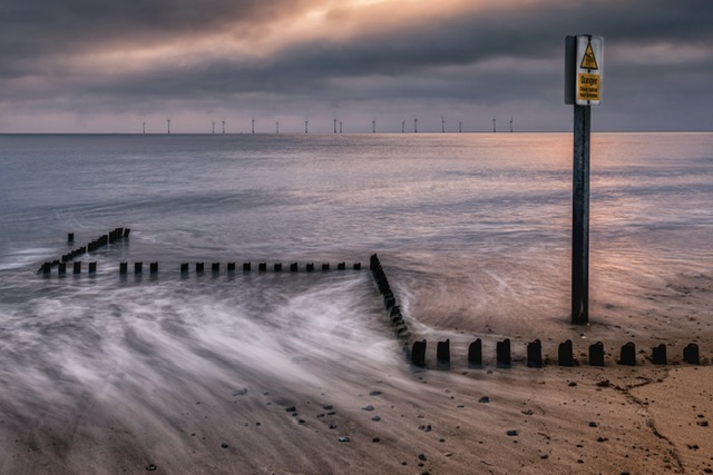
Themed Image (Seeing Double): Coastal Reflections
For this theme, I chose an image from a sunset trip to Happisburgh in August – see blog post here.

Why this shot?
I’ve had this image in mind from the moment I saw the theme – although I have subsequently captured some other shots that would fit the theme, I’ve been determined to get this image in.
Once again, I love the shot.
Once again, it has an emotional connection because on the summer evening I was on a shoot with the guys, I captured this as something quite different to most other shots that night.
I was thrilled to capture this scene, and it holds some pride therefore I want to test the validity of it.
This rationale might catch me out! I wrote about the risks of doing this over any other considerations in previous posts about club competition rounds.
We shall see if I get burned again by doing this!
Post-production editing
I did my usual thorough routine of creating a virtual copy of the image in Lightroom and starting my edits from scratch.
I pushed the image into the Nik collection and chose a filter which enhanced the scene then back in Lightroom, I removed any small distractions such as small stones or distracting spots from the lower part of the image to maximise the minimalist nature of the reflection.
Although I started out intending to find a perfect or better edit than the original one I did on my iPad, I ended up with a similar look and feel.
The end result is a fairly simple edit and I felt content that this later edit was true to the original one. It’s perhaps a little cleaner and polished but only in a modest way.
Self-critique (pre-judging)
I think the scene is striking, and the textures and tones are really good. The reflections are awesome in the wet sand and the sky fantastic.
There are leading lines on both the left and right hand side leading the viewers eye in to the main subject.
What’s to criticise? Let’s see if we can try to self-critique?
- Is the main focus point (the sea defence) too small in the scene?
- Is the object positioned in the centre wrong? It certainly has leading lines from both left and right so it should tick the ‘where do your eyes go?’ challenge.
- Does it tell a story? I think so. The viewer may be interested to ponder why is this lonely metallic sea defence on its own? Where are the rest of the sea defence structures?
- Are the two posts on the horizon on right hand side erroneous?
- Is the cloud in the sky too dark compared to the reflection of it? Are the colour tones different in the top part of the image compared to the bottom part?
- Does the judge hate seascapes? We shall soon find out!
Judge’s Verdict
The judge said the central position of the structure “broke the rules” but they didn’t mind it.
They said there were contrails in the sky which are usually cloned out but personally found them OK.
They liked the colour tones overall and the rusty structure, and they liked the diagonal lines in the two corners and the tide detail in the background.
They even liked the two small posts on the horizon.
They liked the wet sand and textures.
And then…. they gave a score of 8/10.
To say I was gutted is a massive understatement.
Post-judging thoughts
I have to confess, I was gutted with the 8 score as I would’ve bet money on this image getting a 9 minimum.
My main disappointment beyond the score is asking what have I learnt? How could I have improved the image?
A couple of thoughts here… firstly the comments at the start about the central position and the contrails could’ve influenced the score, despite the judge saying they didn’t mind. They must mind!
Secondly, the image may not have evoked a feeling for them – I’ve mentioned previously the perilous nature of our emotional attachment to images we like, which don’t float the boat of a judge. But how do we know and surely their preferences are irrelevant? (It’s all been said before…)!
Despite all my guessing, what I’m missing is what dropped the points here?
I’ve already recovered somewhat from the initial kick in the gut feeling. It is what it is. But… throw me a crumb F.F.S. It would’ve been nice to have something to learn from, something to work on for improvement.
Bitter? Yes!
For Me, this image is a 10/10 all day long… or at least a 9!
I have re-edited the shot and removed the contrails – I do agree with that part of the judge’s feedback, just not the score.
I have also printed the image and put it on the wall at home…

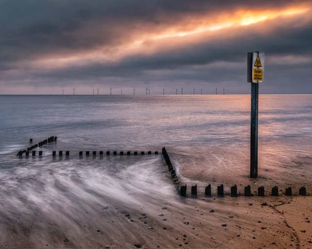
Free Choice Image: Danger Danger
My free choice image below was from a very recent visit to Caister-on-Sea – blog post here.
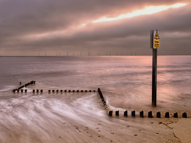
Why this shot?
This shot had received quite a few compliments on Instagram and my fellow landscape club colleagues said it was a winner.
Although I’ve got a handful of images lined up for selection for the free choice round, I really wanted to punt this one in and see where it gets to in the competition.
Clearly the light in the sky which appears to be similar to a lightning bolt, and the “Danger” sign tells the story. The pink tone of the morning sunrise is strong and works well against the yellow of the sand.
Post-production editing
There was one major adjustment needed to make this image.
Due to the wide angle lens and composition, the sign post was leaning so I used the Geometry tool in Lightroom to straighten it but this meant a tighter crop which ended up 4:3 but it looks almost square.
I sent the image to the Nik collection and chose a filter (I often turn to one of either tonal contrasts or details extractor), then back in Lightroom did the usual adjustments to the sky and non-sky parts of the image.
I lifted the shadows on the sign post pole and added more white and saturation to the sign itself.
Having observed some light casting across the sign to the side and the back of the sign post, I brushed in a bit more highlight/white to those areas.
Self-critique (pre-judging)
What’s not to like? Let’s go into self-critique mode.
- Is the lightning bolt in the sky blown out? Yes.
- Is the sky a little too short on contrast? Maybe.
- Are the zigzag sea defence metallic posts too black and almost silhouette? Yes.
- Is the image over-edited and with a potential HDR effect? Maybe!
- Is the crop odd with the signpost too close to the right hand edge? Couldn’t help that!
Judge’s Verdict
The judge said this shot was well seen.
They loved the foreground, and they liked it that the post was above the horizon.
They said they would’ve cropped out the overexposed light in the top of the picture which let the image down.
The image scored 8.5/10.
Post-judging thoughts
I am surprised this image beat the first shot, and perhaps it’s another one that was never destined for a ten?
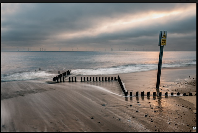
The one criticism about the overexposed light is probably fair – my iPad edit I posted to social media is below and on a second look, the light streak is significantly better controlled.
Whether or not this image would’ve done better akin to the judge’s liking is unknown – I did notice over the course of the evening, they had a theme of picking out overexposed highlights, and on many occasions being quite picky for all images, even those where there was a small area of bright highlight.
With my initial disappointment subsided, and being able to view things through a more balanced lens, I accept the critique, and with hindsight I should’ve toned that light part down, and left the contrast in which I only took out to remove the blotchy look to some of the cloud detail.
Comparing my submitted shot to the iPad version evidences that the judge was right on this matter.
I accept the Judge’s critique for this image (with caveats)! 🙂
If you note my comments in my self-critique above, the first two criticisms and have emerged as a factors in the outcome:
- Is the lightning bolt in the sky blown out? Yes. <– I could have compared my re-edited image to the previous version
- Is the sky a little too short on contrast? Maybe. <– Yes, a few blotchy sky elements would’ve been more acceptable and pleasing on the eye than the impact the reduced contrast had on the light streak
My original thought on the title was that it should be called “Danger High Voltage” (as per the Electric Six record – the video is hilarious by the way – check it out) which would explicitly tell the viewer what I am seeing in the image and what the story is… that the light streak represents a lightning/voltage shape.
What about the cropping suggestion?
With reference to cropping out the light in the sky, for me doing that changes the story of the image completely.
Below is a quick iPad edit with the sky cropped.
I’m not totally convinced the crop improves the image, but it is still a pleasing image but I prefer my original, or certainly the copy I posted on social media.
In summary, two of my own critiques have become reality, and a better title may have done better. This is good – I have something to reflect on, something to think about, learning to improve. Much better than zero benefit!
Final thoughts
Just like some of my fellow photographers, my wife Kathryn could not believe the 8 score for the coastal reflections shot.
The judge seemed a bit dotty, a more polite phrase than my original thoughts on the night.
They held back shots which did not carry a score that usually gets images held back. They heavily criticised images but then gave them higher scores than you would expect, and gave very low scores to shots which deserved more.
Also, for a few images including mine, did not provide anything to go on to help understand the score, and more importantly improve in future. This is one of the main areas for frustration for solo judge competitions.
They did seem to have an element of randomness and/or surprise. Perhaps what I’m really describing here is their proportion of subjectiveness!
Edit: As time has passed, I am more accepting of the judge’s comments and realise there’s a lack of balance to both parties. I demand a 9 or 10 and don’t expect to drop two points for a minor fault. They have the job of assigning a score to an image out of many on the night and don’t have a rule book or benchmark scores to reference so have to do it in the moment, in real time. (I’m digging deep…).
Keylines
They also had an obsession with keylines; a border that you place around an image to define the edge of an image.
I have to confess I’m not at all familiar with keylines – in this instance, I don’t think my images needed them but it’s made me realise I don’t know anything about them, and I probably do need to learn about them.
Added benefit from the results
Digging deep, if I consider any other learning from the evening…
I know now that keylines are a thing, and for some judges, a big thing – so I need to learn more about them.
The disappointment of the evening with the themed image has made me Google more information about competitions and I now have effectively a checklist which I can use to more regimentally test the different aspects of an image.
The only thing to consider on top is whether or not the image offers something different, something a bit extra that a judge may not have seen before, or as often as “just another image”.
One or two of the guys have suggested a critique group which I think is worth exploring – I know two fellow photographers who are part of informal groups that critique each other’s photos. This is something definitely worth considering as it probably makes a big difference to what you may select for the compeition entry.
Then we come back to the same story of the judge’s preference – it’s irrelevant but nearly always is on show during judging. One of the guys in the critique group says he’s had an image judged by fellow photographers including someone who judges as a “10” but it tanks at the actual club judging stage!
In essence, we have to like it or lump it! Take part, or don’t. If this is a form of self-harm, I’m a willing participant. I can’t help myself. It’s me.
Is it a chase for self-gratification? Probably.
Is it me being a perfectionist? Yes.
Is it the competitiveness? Yes.
Is it me offsetting my inner feelings of failure that have sat on my shoulder most of my existence? Yes.
Is it me wanting to be liked, and wanted my images to be liked? Yes, of course.
Is it an addiction to natural dopamine from the wins? Yes.
Is it dollops of imposter syndrome? Yes.
Am I a prat? Yes. I can’t help it.
Is it Me? Deal wiv’ it…
For all of us taking part in these compeitions, we have to “Deal Wiv’ It”:
Deal wiv’ it (Mura Masa & Slowthai) – Spotify / YouTube
Onwards and upwards…