It’s the start of a new club competition season – yay!
Prepare for anticipation, emasculation, elation, trepidation, and frustration.
Why do it? As previously noted, this is a form of self-harm!
Changes this season
This season sees three digital rounds, three print rounds, a panel and triptych competition and the usual image of the year.
Images (and digital versions) are now submitted via Pixoroo which is a much easier method for members and the club.
Edit: In my first publication of this blog, I stated that the club would not be displaying aggregate scores / league tables but I was wrong and these are now on display on the Pixoroo site.
Each round provides a theme and members can submit one or two images but where two are submitted, but both must be on theme.
I’ve no idea if there is a photographer of the year (POTY) award – there was supposed to be last year but nothing happened.
Where is Victor Meldrew when you need him? “I don’t believe it!”. 😁
Theme for Round 1
The theme for this first round is ‘Urban Rhythms’ and below is the brief.
Description: Explore the heartbeat of the urban world. From street life and traffic flow to geometric buildings or gritty industrial zones, reveal rhythm and repetition in human made spaces.
Below is a collage of images from last year and a recent trip to London.

Both of the images I selected for this round are from a London trip I did last April (2024).
Image 1 – Portal Beneath the Towers
I chose this image because I liked the shapes and angles and felt it met the brief.
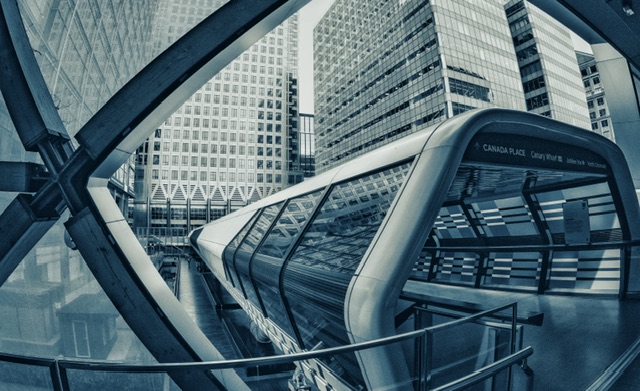
I did quite a bit of refining in the editing stage including hiding a distracting shed in the left hand side and there’s a different crop and more of a silver blueish metallic look to the one for competition.

Self-critique (pre-judging)
I like the shapes, angles and curves to this scene and I think it is a clean edit and of good quality.
I have an inkling it may be missing a wow factor so anticipate it could only achieve 8/10.
It’s to be noted that scoring will now move to the more common x/20 so moving forward where I mention 8, it will be referred to as 16 and vice-versa.
Judge’s verdict
The judge said this looked like Canary Wharf (note there was a clue in the sign above the tunnel).
They said the glazed glass panes made the eye move to the tunnel and towers and felt it had been taken with a fisheye lens which adds to the feeling of drama for this image.
They liked the mono with blue tones of the image and said they liked this image a lot.
The judge awarded this image 18 (or 9/10) in old money.
Post-judging thoughts
I’m pleased the blue tone was well received and my careful edit and thoughtful post-production served me well here.
This image exceeded my expectations so I’m pleased with the 18 score.
Image 2 – Colourful Commute
I chose this image as I think it has a lot of the required attributes of the theme.
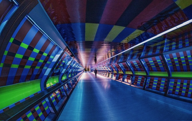
There are lots of shapes, repetition, interest and the image pulls your eye in and along to the end of the tunnel.
Below is a mono conversion edited last year which I don’t think has the wow factor of the colour version.

In starting a new edit, I flipped the image around as I think I recall judges comments that an image drawing the viewer in left to right works better than right to left.
I cropped to get the lines in the corners and I used Nik Color Efex to make the image and colours pop.
I then cast my eye over the image multiple times removing any distracting flaws, spots of random light to really clean it up.

Self-critique (pre-judging)
I have higher hopes for this image and would be disappointed not to see it be held back and in contention for one of the top choices – as a minimum, I think it should get 18.
Aside from the appeal of the leading line, person for scale, repetitive shapes and patterns, colours, it has a lot of interest.
The reflections add interest and I went to a lot of effort to make sure the emerging tunnel lines touched each corner.
Annoyingly, and post submission while writing this part of the blog, I notice the line across the tunnel floor third way up behind the man has some dominating dark areas which I had not noticed at all during final editing.

In mitigation, this is the shadow of the buildings above and has not been modified (other than the global editing applied).
There’s a huge chance the judge will pick on that and I’ll lose some points but it’s done now!
It’s incredibly irritating as I can’t not see it now and wish I had brushed in some lighter tones to calm that area down. 🫣
Judge’s verdict
The judge commented that they were not sure where this shot was taken and pondered if it was in a city and thought that it probably was (Yes mate, it’s London and the same location as the previous image)!
They then leapt in immediately with a criticism about the man not being on the third! That was a bit disheartening as I spent a lot of care and attention cropping to this final image to make the figure more prominent.
The judge did appreciate the lines going into the corners which was nice to hear, as I spent ages getting that right.
They said the image had powerful leading lines and the figures in the distance were on a third.
They commented on the coloured panels in the tunnel and wondered if these were LEDs or painted panels in the ceilings, but then realised quite rightly that they probably are LEDS.
They did not spot or comment on what I thought might be a major flaw.
The judge awarded a score of 17 (8.5/10).
Post-judging thoughts
I am a little disappointed as I felt this was my strongest of the two images.
This image under-performed to my expectations.
I feel they were a little too obsessed with the man not being on the thirds and I think it deserved a bit more but there you go, who the hell am I to comment?
Reflections
There were 54 images in this round and quite a lot of bang average shots which the judge over-scored in my opinion.
Overall I’m pleased with 17.5/20 or 35/40 which is 87.5%.
Given my apathy for the theme, I did well and also when compared to some of the experienced club regulars holding photography qualifications, I did well.
It is something of a relief to see this theme done.
I have shortlisted images for all the other rounds save for the last one (called ‘The Local Story’) which I anticipate will be even more challenging than this round’s theme.
With six months on the clock, I have plenty of time to sort out a couple of images for that last round.
Coming up next month is the first print round with the theme of ‘Timeless Beauty’ so I’m looking forward to firing up the printer and running off some prints.
Onwards and upwards…