The Theme
Life is a stream of colour. Red, blue, yellow, and a billion pigments in-between!
This round is all about colour-inspired photographs… literally and figuratively… A scene, a detail, a narrative or mood. A single tone, or a technicolour daydream.
Urban street scenes, portraits, travel adventures, landscapes, editorial, conceptual, still life – the challenge is to colour our lives…!
For obvious reasons, monochrome images are not allowed.
Hopes, aspirations, objectives…
My objective was to maintain this new target objective of getting scores higher than 8/10.
As I was unable to attend the judging evening, a fellow club member (Bill) offered to capture the judge’s comments, so thank you Bill.
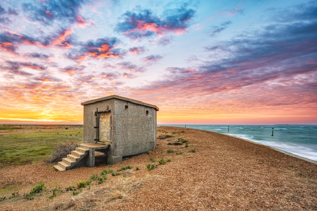
Themed Image (Colours): Sunrise Colours at Landguard
I was going to choose a shot from Happisburgh at sunset last year taken on my everyday Fuji camera.
But on closer inspection, it was very noisy and grainy due to high ISO and far too narrow an aperture.
I was also concerned about the out of focus flowers in the foreground, although I intended that when I took it.
I went back to my shortlist, and decided to revisit the shot below from Landguard.
Why this shot?
I’ve always thought this shot was suitable for a competition entry – it almost went in for the ‘Abandoned’ themed round last season.
On closer inspection, it’s quite “clean”. In other words, it was taken with care at base ISO, sharp focus and a good composition. The epic sunrise sky of course adds to it.
I also had a good idea that I could boost the colours which would really fit the theme.
How and when did I take this shot?
This capture was from a superb sunrise visit to Landguard Point on a bitterly cold morning in December 2022 where we were treated to an epic sky – see blog post here.
Post-production editing
I did my usual of taking a virtual copy and resetting the image, some very basic editing then the image was sent over to the Nik collection for some punch and colour enhancements.
Other than that, there was little else done to the image except…
I had a concern about the bright streak of sunlight over the horizon on the left hand side, so revisited it and toned it down as Lightroom was showing some minor highlight clipping.
Self-critique (pre-judging)
I’m very pleased with this image.
I personally consider that this is an excellent submission for the theme of ‘colours’. (no smugness intended, just a biased opinion)
I’m not sure what a judge will criticise. Perhaps the bunker is lacking explanations but surely that tells or asks the viewer to think more about it? There must be a story here?
They may claim the streak of light above the horizon on the left is blown out, but it is NOT. It was but it’s been dealt with – I expect it may still receive a comment and possibly lose marks.
The sky has some ‘grain’ to it especially in the top right of the image so that could be picked up too.
Judge’s Verdict
The judge said that the author had done well to find this hut on the shoreline.
They said there are some really nice colours in the shingle and sea that’s working well. Colours are also visible in the greenery at the front of the building and some yellow flowers, but they said it was the sky colour which probably caught the author’s eye.
They said that the author had done well not to get too much burnt out in the left hand corner, where obviously the sun ins rising or setting on that far side, so they thought that was working quite nicely.
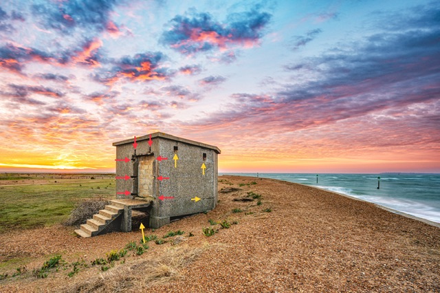
They wondered if something could’ve been done regarding the doorway to the building – they found the bricked up doorway a little but ugly. They wondered if I could’ve maybe closed some of the gravel over onto it, and made it all the same.
The image was held back and scored a 9.5/10 winning the themed round in my league.
Post-judging thoughts
It goes without saying that I’m chuffed to get such a high score and win the round.
Regarding the doorway of the bunker, I’m unsure I would’ve changed the structure as I saw it, and as I wasn’t there on the night of judging, I can’t say if this was nitpicking or not.
Below is a copy of the image with red arrows showing where I think the judge wanted me to clone out the gaps in the concrete.
What I’ve noticed looking again is the potential distraction under the steps, and I’ve put a yellow arrow where I think (with hindsight) I should’ve filled that in.
The judge’s comments have made me look more closely at and around the hut more.
I do agree with the judge’s comments actually, but in the essence of an image on the eye, and tidiness.
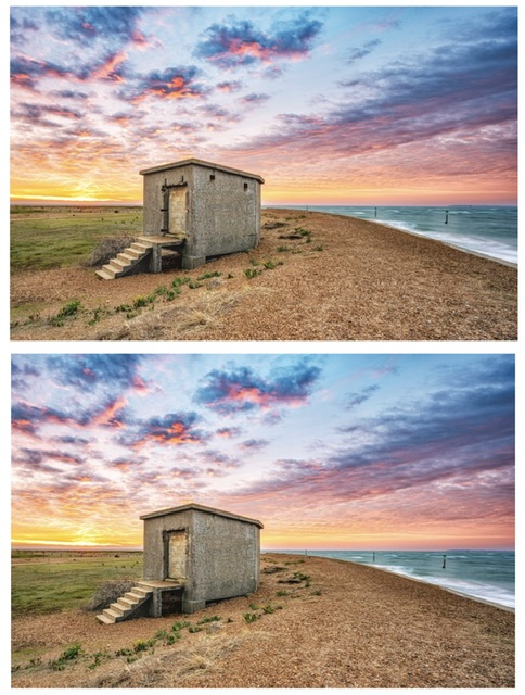
I’ve done a quick edit to remove those distractions including the rusty squares on the side of the hut and it definitely looks cleaner – see below for before and after comparison:
There is an obvious conflict though… I am being encouraged to change a structure as it exists, and change a bunker / hut from WWII that in its original form shows decay from the passing of time.
The “ugliness” could be argued illustrates the age and state of the structure, and is part of the story.
If one is expecting beauty (the opposite of “ugly”) from a WWII structure, I am unsure that this would ever be achieved!
In summary, the judge has helped me look at some finer details again, and there are elements I would alter, but I’m unsure about the modifying the doorway.
Am I bitching because of not getting a 10 and world domination? Yeah probably!
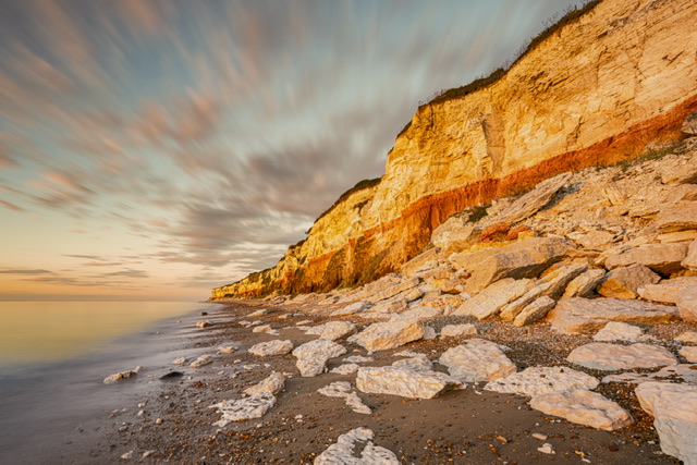
Free Choice Image: Sunset at Sunny Hunny
For my free choice image, I punted this shot from a club sunset trip to Hunstanton last Summer.
Why this shot?
I’ve wanted to put this in for competition judging for a while. However, my wife’s opinion is that it’s not that good!
How and when did I take this shot?
Last August, on a delightfully warm evening, several of us met at Sunny Hunny (aka Hunstanton) and had a great evening taking images.
In my mind, we were going to get the big boulders and the sun over the horizon. However, the tide was much further in that we had expected.
I took a shot with the cliffs in the scene and I was shooting, I thought I would slap a filter on and try a long exposure. Much to my delight, I got some movement in the clouds, and smoothed out the water.
Post-production editing
As usual, I re-edited this shot and sent it to the Nik collection for enhancement of the details.
I then played around with different crops and also with the sky – I wanted a more subtle edit for the sky than the original one I had posted on social media.
Finally, I played around with the brightness on some parts of the cliff to tone down the areas with the highlights.
Self-critique (pre-judging)
Personally, I think this is a competently taken shot of a famous seascape and really good.
It may provoke a marmite reaction. What is there of interest? What story does it tell?
It could be a 7-8 shot and never to be a 9-10? My Wife Kathryn doesn’t rate it, and I have been wrong in the past to ignore her opinion.
Judge’s Verdict
The judge liked the angle this shot was taken, just looking down this cliff face, right down to where you’re going is on the thirds there which is good.
They said there re some nice boulders in the foreground.
The judge felt the image needed a person somewhere in the scene, either sitting down or walking along the shoreline, to give the image a sense of scale, which they felt would’ve just enhanced this picture in a little more.
They said there’s lovely detail in the rock formation which they thought was fine, and they observed a slow shutter such that the sea goes milky, and then getting some character in the sky which is nice they felt that worked well.
The judge said it was quite nice. They felt a person would’ve enhanced the image greatly, and they scored the image 8.5/10.
Post-judging thoughts
I have no complaints with an 8.5 and I actually agree with the judge that a person (or maybe a boat, or even something in the sky) would’ve given a sense of scale.
Would it be valid to add a person or figure in Photoshop? That’s beyond my current skill level, and I didn’t even think of this anyway.
There wasn’t a person there so it is what is it, a seascape scene.
Reflections
To bag 18/20 overall is really good, and exceeded my target objective.
With the Landguard shot, I do agree with the judge albeit I think the gap or distraction under the steps is worse than the doorway. There is scope to “tidy” the hut.
For the Sunny Hunny shot, I agree that there needed to be something for scale but whether that warranted a 1.5/10 or 3/20 points deduction is debatable.
The shot is technically competent and pleasant but I did say in my own critique I wondered if it was ever a 9 or 10.
Overall, very pleased with the points yield, and unusually I find myself overall finding the judge’s comments reasonable and helpful.
I understand that other club members had a more unfavourable assessment and also that there was inconsistency in comments vs score.
In terms of the risks of judging, it appears I have escaped from the experience of hugely subjective and contrary commentary and non-matching scoring this time round.
Onwards and upwards…