NDPS has done a good job this year making the competitions individual ones but with the option to participate in all of them all for the coveted POTY (Photographer of the Year) award.
This means that members can challenge themselves in individual competitions across digital, print and panel production but also across the range too if they wish.
I intend to do all of these as I usually do the digital and print rounds so the panel round is going to be a big challenge for me this year, simply because I’ve never done a panel before.
Anyway, back to this print round…
Print League Round One Theme: Contrasts
This round defines contrast across a wide-range of interpretations – tonal, monochrome or colour, or conceptual.
To be fair, as I foresaw this to be one of the rounds I may struggle in, I’ve gone with an image which I hope has different contrasts and therefore hope there are some tonal elements.
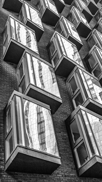
Themed Image (Contrasts): City Windows
Why this shot?
There are a few reasons. Firstly, I like the angles and believe it’s got lots of interest. I think there are some tonal ranges and contrast within the brick work and other parts of the image. Whether or not it meets the brief and is good enough in a judges eye is another matter. There’s also the judging of the print edition.
How and when did I take this shot?
I took this shot in London earlier this year while on my way from a hotel to a conference for work. I had packed my Fuji and took only half a dozen shots literally while walking along. I have a work colleague to thank as they pointed out the interesting buildings and shapes, and encouraged me to take some shots.
Post-production (editing)
The original image was different in that I ended up flipping it around and doing a crop to ensure the lower window was in full view. I felt these adjustments emphasised the windows better.
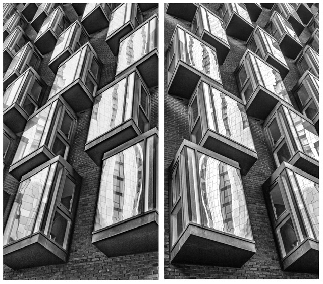
I did some basic editing in Lightroom then sent the image into the Nik collection’s Silver Efex Pro and chose a filter which would accentuate any contrast.
I decided that a 16:9 letterbox crop in vertical format would best suit the image.
Originally, I rotated the image 90 degrees right to “mix it up” a bit but decided that was futile as it would lose the context of what the image was and is probably an example of me trying to force creativity when I have very little naturally in the tank!

Printing
Following a fantastic club presentation on printing by Ian Wilson, it inspired me to branch out and try some new papers.
I had observed from the wide range of mounted prints on show at the presentation that a lot of Ian’s prints were on Permajet Portrait White and also that he had raved about a Titanium paper, so I purchased a box of each and a test pack too.
After downloading the print profiles to my computer and making sure the printer was set to the right paper type, I created a soft proof copy of the image in Lightroom and made a few tweaks and the Portrait White paper came out best.
From my existing Fotospeed paper, NST White also looked good which was nice as it’s a paper I had been disappointed with to date, but I had blatantly bought it based on Pro photographer Nigel Danson wowing about it.
Yes, why don’t I try them all and make my own mind up I can hear you asking? Maybe I’m too lazy and considered using papers that Pros recommend as being a shortcut.
With the print part completed, I had also decided that my prints would have a border on show around the edges of the print and inside the mount aperture. It appears that 12mm or thereabouts seems to work.
Mount board production and allowing for a border inside the aperture
I measured up and set to work mount cutting following this process for a 500mm x 400mm mount board.
Please do scroll down to skip this part if not of interest!
- Measure the size of the image printed W1 x L1
- Add 24mm (2 x 12mm) to allow for the borders which gives you aperture or window size for the mount W2 x L2
- Work out the left and right hand border / margin size BLR (Border Left and Right) = (500 – W2) / 2 and BTB (Border Top and Bottom) = (400 – L2) / 2
- Draw the lines out on the back of the mount board – this is where my G&E Technical Drawing CSE from school comes in handy and where my perfectionism can drive me nuts!
- Measure BLR and mark two points upper and lower and draw lines for left and right cut fuidelines
- Turn mount board 90 degrees and do same for top BTB
- Put the mount cutter to work and carve out the aperture – left and right / top and bottom
- Place the mount over print to check sizing – slice off excess parts of the printed image paper
- Place a piece of tape sticky side up on one edge of the print
- Place the mount board over the image carefully lining up to get the white board equidistant all around the aperture – measure with ruler to check consistency – double check the image is straight
- Slide the mount over holding the print in place by an edge, and apply masking tape to the top of the print to fix it to the mount board – one tip I learnt last year from fellow club members was to just tape the top of the print so the print doesn’t warp in different temperatures.
The final end product is shown below:

I choose to shrink the size of the image as I’m fast coming to the conclusion that a smaller sized image can help draw the viewers eye in. It’s not a universal every print thought but something I’m conscious of now.
Judge’s Verdict
The judge said that this shot was about tonal contrasts and liked the repetitive pattern of the windows.
They said it looked good as a black and white image and said there were blacks to whites in the image. They observed that there was visible detail in the blacks.
They said that it would’ve been good for one of the windows to be open near the top to have a specific focal point where the viewers eye would stop. Without that, they felt the viewers eye drifts upwards with no place to stop or return.
They observed lighter tonal buildings behind the photographer which reflected in the windows.
The image was scored at 8/10.
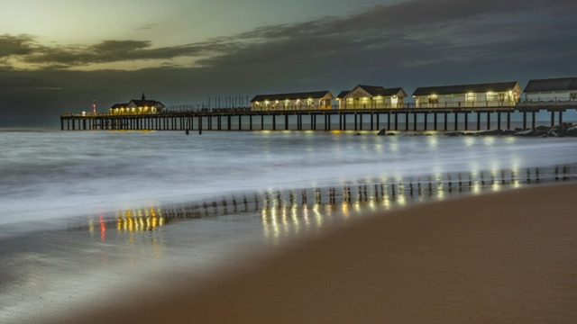
Free Choice Image: Blue Hour Morning at Southwold
For my free choice image, I picked this shot from a sunrise trip to Southwold.
Why this shot?
Aside from the usual reason that I really like this image, the main reason is that it’s different. Although it’s a well known and heavily photographed scene and location, the blue hour and coloured reflections of the pier lights is what makes it. Is it a 10/10 shot? Who knows, but I’d be disappointed if it didn’t get 8-9.
Editing
I re-edited this shot with some basic adjustments and removed one or two distractions such as a groyne post peeking through the underside of the pier and a similar element further left.
I had to be careful with sky and inverted sky edits as the gaps between the pier legs was not auto-selected by Lightroom and I wasn’t going to faff about by editing between each of the wooden columns!
I brushed in a little more clarity and colour into the reflections and decided that the ship behind the pier on the horizon must stay as it looked like a job too tricky to try and remove it.
This image also had a letterbox crop as the pier was so long. I did worry a little that there was too much pier and insufficient space to the left of it but didn’t want to lose any of the lights and reflections.
Printing
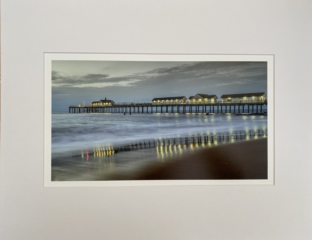
After some test prints, a Fotospeed Platinum Baryta paper worked best for this image.
The final end product is shown below:
Judge’s Verdict
The judge said it was good to know that this was in the morning (for a moment, I wondered if they were taking the p***), and it was good that the scene had detail in the sky which was needed.
They liked the reflections of the pier lights in the sand and noticed that even the red light at the end of the pier was reflected in the sand.
The judge liked the dark wet sand in the bottom right of the image which they said was consistent with the early morning and they observed the slow exposure to blur the water.
The image was scored 8/10.
Reflections
I have to confess I was a little flat after the scoring – while I had no expectation that I’d get 10’s, I thought the images might get just a notch over 8 and maybe towards and into a 9.
Some images in the competition I felt were quite plain or just bang average scored similar and I suppose when I think that the lowest score was 7.5, it makes me feel that 8’s were a #fail.
This is precisely what can deflate you when being judged – not just the score for your image but the comparison to other images.
A reminder about the subjective nature of judging
I have a thought about a fellow club member who is a very talented photographer who has chosen not to take part in these competitions as they describe judging as a soulless experience. As I feel right now, I do understand their point of view, and I wrote in the last competition blog post about the subjective elements of judging, amplified when there is only one judge.
Sometimes, you get comments on the image and to be fair often some positive feedback, but little to go on in terms of what could’ve made it do better. Perhaps in these situations the judge is effectively saying that it lacked the wow factor?
City Windows
For city windows, I liked the angles in the shot and when I saw the image under the lights at the club venue, I did wonder if a darker edit could’ve made it a little more dramatic. However, the composition and in general the scene clearly did very little to make an impression in the eyes of the judge.
From the feedback, the learning here is that I need to think about how the viewer’s eyes will move around the image, from a starting point to an end, or back round again.
Blue Hour Morning at Southwold
For the Southwold shot, I guess other than the colourful reflections, it’s nothing amazing. I liked it because it was different to many other Southwold shots but it’s probably a “nice” image rather than a “wow” image.
A more detailed sky might have helped but blue hour may not often (if at all) provide that. If I take my emotional feeling away from the pride of capturing this, I can see that it’s not in the “wow” category.
Effort and Reward are not always synchronised
if I’m to progress, I must dust myself down, reflect, and learn how I can create images that have more impact. I am confident I’m taking technically competent images that have a much more impactful visual appeal.
I think the other factor in why I’m feeling disappointed was how long I spent on cutting the mounts and lining up the print to ensure the inner border was consistent. However, effort spent on producing a print has no impact on the image or impact if the image itself is just a scene.
Don’t we all do things in life where huge efforts go unnoticed, are unappreciated or we’re judging the outcomes based on efforts that are either irrelevant or not part of the judgement of the outcome?
We often think about the sizzle but what really matters is the sausage!
Learning and moving forwards
I keep doing it, I keep putting forward images that I like – what I think is good, but I’m not sure I can turn that part of my brain and emotion off!
I may have to rethink my image capture, or rather how can I produce more impactful work?
Edit: With my hurt pride somewhat dissipating since I drafted this blog post, and leafing through my catalogue of contrasty mono images, I believe I have stronger images and compositions in my library that could’ve been stronger contenders. Therefore, perhaps it’s more about choosing the right image for maximum impact moreover completely changing my capture process?
Yes, there are gaps in my learning and experience (I’ve acknowledged compositional eye and foresight shortcomings before) which need addressing but it’s not a total #fail that I felt post judging.
Brutal truths
My wife has plenty of advice and opinion which tops my glass half empty up into the glass half full, or maybe half of a half more full! 😄 She reminds me of my ten scores, my enjoyment of photography, my magazine feature, the friendships I’ve acquired and enjoy, my exhibition shots and also some brutal truths where I’ve pledged to improve my learning but haven’t progressed it.
She asks… “Have I developed my compositional skills at all?”.
As she knows, I have a set of videos on composition which I’ve failed to complete. I recently bought a pro photographer ebook on composition. Have I watched all the videos? Have I read the ebook? No! I have not! Time to knuckle down and put some effort into developing my compositional eye.
Benchmarking
Since the competitions are individual ones but also within a cumulative element, I can’t really judge my progress comparing apples with apples.
My cumulative score thus far is 50.5/60 or 84.2% which means little without an equitable comparison or assessment against other members.
Final thoughts
Plenty to contemplate, and plenty of improvement to work on.
At the end of the day, I enjoy taking images and I enjoy the output I produce, and many folks also enjoy the output, even if in the eyes of one professional judge in a subjective moment in time isn’t wowed.
Onwards and upwards…